7 Problems With Automating Factsheets In PowerPoint

Maintaining a strong and positive brand image is more important now than ever. Every contact with a client and every piece of material they see from your firm needs to be professional, timely and well produced. Even something as mundane as a poorly produced factsheet can be off-putting and give an investor pause to think about the overall quality of your operations. Yes, even in the digital age, quality design and typography in printed materials really matters. That’s why automating factsheets in PowerPoint is a bad idea.
A long-time head of marketing for a major asset manager once said to me: “If you look at the most successful companies in any industry, you’ll find that they share one thing in common; excellent branding.”
Your firm’s choice and use of fonts, graphics, layout, colors, styling and even paper can deeply influence your audience. Research has indicated the skillful use of typography can affect readers’ emotions and their performance in other tasks. In one study, researchers found when good typography is used, people frown less and perform creative cognitive tasks better afterward, and have better retention of the information provided.
According to a recent Study by Deloitte, 85% of firms are currently deploying or testing cloud-based technologies for marketing and asset gathering. Factsheet automation is among the list of technologies being implemented, and there are a variety of software solutions to choose from, ranging in nature from DIY to Outsourced to Hybrid.
Surprisingly, more than one of the solutions for factsheet automation are based on Microsoft PowerPoint. This approach is well-intentioned. It aims to offer a user experience and software solution that is easy to use internally, theoretically lowering literature production costs.
But the question to ask is, Does using PowerPoint actually improve and enhance marketing production processes and real-world outcomes?
Can You Effectively Automate Your FactSheets with PowerPoint?
To answer this question, it’s important to look at two things:
- The internal efforts required to use this type of DIY software
- The quality of output PowerPoint can support
By inspecting mutual fund factsheets produced through a PowerPoint-based system, you can see that typography and quality control issues can be the hidden cost of having this product familiarity and user control. We cover the cost-effectiveness of DIY solutions in a separate piece, but in this document, we are focusing on the quality and consistency of results. The two topics have a key commonality, though.
Some of the design, typography and layout issues we’ve illustrated below may be caused by limitations of the tool (PowerPoint is not a commercial-grade design or formatting tool). Others may be due to having under-qualified (or overworked) users involved in the design, template management and/or production process. Many of the issues created by using a DIY tool are self inflicted and only partially related to the tool itself. For instance, what if the person tasked with learning the DIY tool skipped out on the “Text Alignment Tips & Tricks” training session? Or what if the user who mastered the DIY tool leaves and his or her replacement is clueless and has yet to go through training?
There is much room for error with the DIY (PowerPoint) model, and we’ve illustrated some of the issues below. These examples were pulled from factsheets posted on the public websites of a few different asset management firms. We verified through metadata that the documents originated in PowerPoint and worked to obscure the source of the material so as not to be casting aspersions on the firms themselves.
1) Financial Tables
Accurately and visually communicating product data is the main function of investment product marketing documents like factsheets. It’s important for the charts and graphs to be clear, correct and legible. The impact of your data visualizations is dependent upon how well data is rendered. Microsoft PowerPoint has limitations with regard to financial tables and their unique formatting requirements.
Here’s an example of a chart produced by PowerPoint automated system:
Sample 1
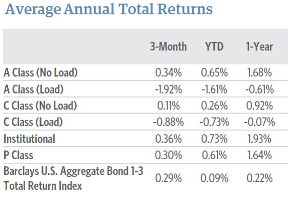
Two financial data display limitations are shown above. A column of financial values should align on the decimal point, but PowerPoint does not have this feature. If you look closely you can see the numbers in the 3-Month, YTD, and 1-Year columns don’t vertically align. Alternately, the user who sets this table up could have chosen to right-align the data in the columns, but with PowerPoint’s lack of finesse, the headings still wouldn’t align or look well done.
Additionally, percent or currency signs in a column of numbers like this should usually appear in the first row. Then, they should be “implied” in the numbers below,reducing the visual clutter in the data set. True, some designers may choose to show the percent or currency symbol in each row, but with PowerPoint, it’s an all or nothing decision. We’ll show additional questionable ways we see this being handled in later examples.
If you stare at the AATR table above for a minute, you’ll start to feel the eye-fatigue that comes from reading poorly formatted content. Subconsciously this is very distracting and the data loses some of its potential meaning and impact.
Here are a couple more examples:
Sample 2 shows an odd choice of alignment (left?), which a quality typesetting professional or automation system wouldn’t have made. This is usually a dead giveaway that a DIY solution was used to produce the table.
Sample 2
In order to get around this problem, in several other PowerPoint samples we found, the company put the percent sign up in the heading and then the table just displays the values, which isn’t a best practice and may be confusing for the reader.
For comparison, a well typeset financial table should look like sample 3 below. Notice the precise alignment, three levels of shading, the stacked and spanned headers.
*Sample 3 below is altered to obscure branding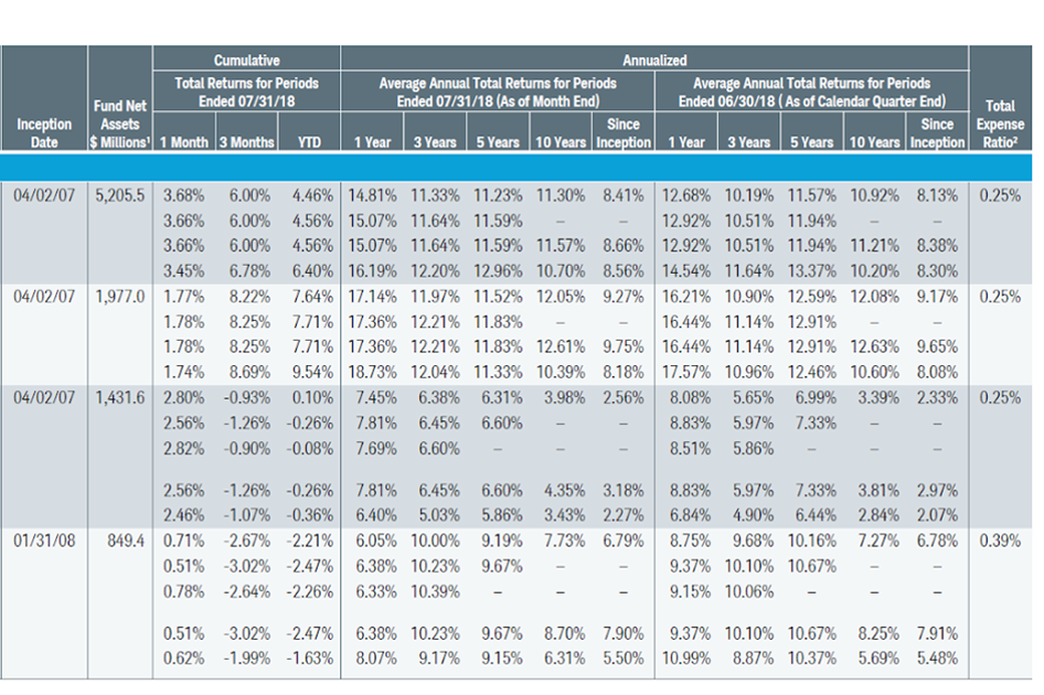
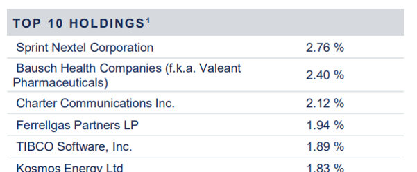
Sample 4 below indicates a DIY system that is not set up with proper wrapping or alignment rules. Notice the funny wrap in the Bausch Pharmaceuticals label, as well as the awkward column spacing that leaves the values column hovering in space.
Sample 4
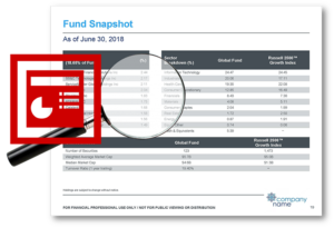
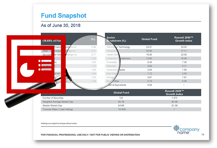
2) Space Use and Alignment
It’s common to see issues with spacing and alignment of components in documents that are automated in PowerPoint. In sample 5 below, you can see there are several issues:
Sample 5

- There is unnecessary whitespace under the heading in Sector Allocation. In fact, each heading has different spacing from the component that follows.
- The heading bar and rows in the Sector Allocation and Credit Quality Tables don’t line up (and they should).
- The Sector Allocation component crowds unnecessarily into the Portfolio Characteristics table.
- There is inconsistent column spacing between the tables on the left and the tables on the right.
- There is needless whitespace at the bottom of the set of components that will make it difficult to squeeze-in the footnotes on the page.
You’ll also notice inconsistencies in the quality between different documents in the set this sample is pulled from. Some sections similar to the above sample are setup up much more professionally. This usually indicates that humans are getting involved to fine-tune the formatting at runtime and the templates are not properly shared (Here’s an interesting read about the “Save As” Phenomenon). When human beings have to get involved, it introduces risk and slows down the process.
Humans are poor at consistency, and excellent at inconsistency. Sample #6 furthers this point:
Sample 6
In Sample 6 above, you’ll notice inconsistent spacing, fonts, heading sizes, etc. White space where it’s not needed and unnecessary space squeezes.
3) Typesetting Rags, Widows and Orphans
High-quality typesetting standards are extremely hard to achieve with PowerPoint. It’s not built for this type of work (it’s built for presentations). The typeset process results in text and images carefully being arranged in preparation for printing or display. In the samples below, you can see the user opted for a “fully justified” text flow to align the left and right edges of the text column. This newspaper-style formatting requires real finesse with adding and removing fractional spacing between words and letters to achieve the right effect. Only high-quality typesetting systems using proper type 1 fonts can usually do this well… especially if the column width is narrow.
Sample 7
In Sample 7, we’ve purposely cut off the text on the left as part of our efforts to obscure the source. Focus on the line endings on the right side of this column of text. There are a myriad of issues.
- There are many words that should be wrapped to the next line. Small words like “a, or, if” shouldn’t appear at the end of the line alone.
- A numbered list shouldn’t separate the number from the text that follows.
- A parenthetical statement shouldn’t separate the first word from the rest…especially if it’s a short word like “If.”
Again, these are all well-established typesetting best practices that should be followed by any person or system producing a professional document. The website Fonts.com includes many helpful articles that go into much better detail about quality typesetting.
Here is another example of poor handling of fully justified text (Sample 8), which is simply indicative of the use of a consumer-grade publishing tool, not a commercial quality tool or service.
Sample 8
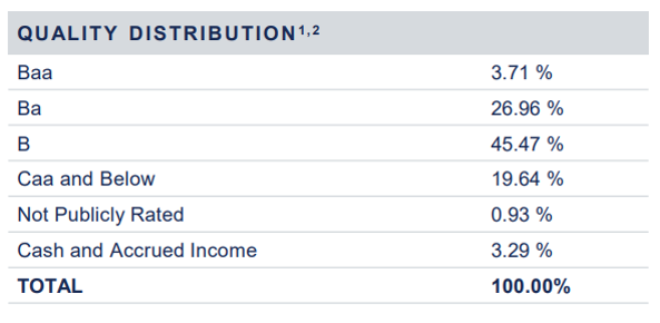
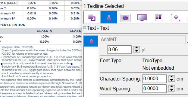
4) Fonts and Colors
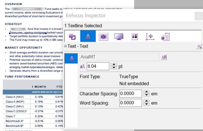
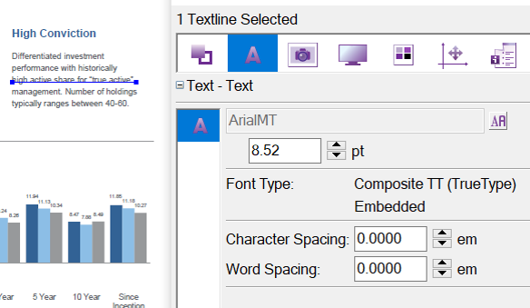
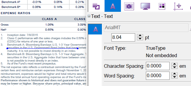
Fonts can be problematic in PowerPoint, particularly if your firm uses a customized or specialty font as part of your brand standard. More than one asset manager has complained that their new PowerPoint-based publishing tool wasn’t able to use their brand fonts. Imagine the marketing team’s dismay as they had to substitute their documents’ font with a generic “Arial” or “Calibri”. This can be disheartening especially when you know your brand image relies on using your style guide consistently.
In Samples 9 – 12 below, you can see that we ran the text through an inspector tool to see how it was being handled. You can see that the font is TrueType, not embedded, and there is no character or word spacing because those features aren’t available in PowerPoint.
Sample 9 Truetype/composite examples
Samples 10-12 Inconsistency in fonts
11 Inconsistency in fonts
12 Inconsistency in fonts
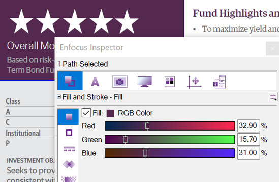
Managing colors in PowerPoint is even more problematic. Microsoft products only work in RGB color spaces (Red, Green, Blue). This is generally adequate for rendering on TVs and video displays. This method of color rendering was invented for low-definition color TVs back in the 1960s. However, your branding team is almost assuredly prescribing your color schemes in CMYK (Cyan, Magenta, Yellow, Black). This is sometimes called “process color” or “4-color” support. CMYK is considered more accurate and RGB equivalents are always faintly off from the CMYK standard. Worse, if your branding uses Pantone or “Spot” colors, there is no standard equivalent in Microsoft products. This limitation requires further “dumbing down” of your brand standards, all in the name of making things simple for internal users to DIY their publishing efforts, as seen in sample 13 below.
Sample 13
5) Inconsistencies and Odd Artifacts
Below, in Sample 14, notice the stray dots blotching up the Risk footnote. Throughout the eight paragraphs of this section, the font changes and the alignment shifts between full justification and left justification; you’ll notice the wrapping changes below.
Sample 14
In Sample 15, the columns aren’t sized equally between components. In addition, the presence or absence of the line under the shaded heading is inconsistent.
Sample 15
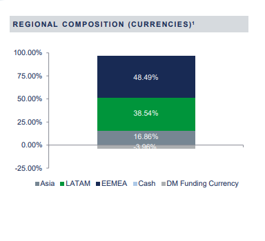
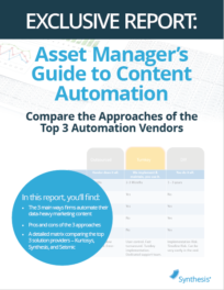
6) Charts and Graphs
In our latest report on the Top 3 Approaches to Content Automation, we discuss the limitations of PowerPoint in terms of charting and graphing. Lack of options, difficulty with formatting adjustments, inconsistencies and limitations of the data renderings are all issues cited by marketers who have used PowerPoint-based solutions to automate their factsheets. If you compare factsheets produced by a commercial-quality automation publishing system vs. PowerPoint, you’ll notice that the PowerPoint charts and graphs are very basic and limited to what’s out of the box. And, they don’t always render well. For example, Samples 16 – 17 were taken from a factsheet produced in PowerPoint. Notice the -3.96% figure is cut off.
Sample 16
Sample 17
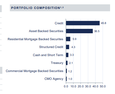
In sample 17 above, the Commercial Mortgage-Backed Securities line goes beyond the header row and into the column “gutter.” This will wrap to two lines and vertical spacing should adjust automatically when following best practices.
When pulling down factsheets produced and automated in PowerPoint, we saw some charts and graphs that appeared to be higher commercial quality. Upon further inspection of these documents, however, we noticed these images appear to be produced externally by another system and dropped into the .PPT document. In other words, a non-automated process and extra tools are being used outside of PowerPoint, which adds time and cost to the project. That being said, our opinion stands that PowerPoint charting and graphing is sub-optimal for factsheet production.
7) Output Transformations
As we looked through many factsheets produced in PowerPoint, we noticed odd choices with regard to data transformations. A transformation is a system’s ability to take one piece of content (a data point, or piece of language) and transform or substitute it with an equivalent that improves the layout of the document or the understandability of the content. In Sample 18 below, the Total Assets figure should have been transformed to appear as “$3.24 Billion,” as this is a best practice. A 10-digit number is never user-friendly or easy to digest.
Sample 18

To be fair, sometimes these issues are due to poor design choice or user mistakes, and not the software. However, this further illustrates the problem with the DIY approach to automation.
Conclusion
These examples illustrate how PowerPoint isn’t an ideal tool for automating any professional materials, especially factsheets. PowerPoint is best suited for creating presentations that are not very demanding typographically.
While it is possible to automate factsheets in PowerPoint, it takes a considerable amount of user intervention to get the pages to layout nicely. Commercial print-quality output simply isn’t achievable through PowerPoint. Adobe InDesign is the benchmark tool for quality desktop typesetting. Your automation solution then should be able to meet or exceed Adobe typesetting quality in order to be competitive.
Even though software familiarity seems like a positive choice, you’re better off with a solution that minimizes the need for humans. When users have too much control to make changes, you’re working directly against the risk management and benefits of automation.
For a complimentary evaluation of your factsheet solution or to discuss your options for automating your quarter-end marketing process, give us a shout!
To learn more about the pitfalls of automating fact sheets in PowerPoint, listen to our Podcast interview below. Terry is a former Head of Marketing for a large global asset manager. She discusses her firm’s problematic implementation of a PowerPoint-based automation tool and how it affected ROI.

 From the Blog: 3 Factors that Complicate Factsheet Automation |  From the Blog: How much does it cost to automate factsheets? 🧐 |  From the Blog: Print is Dead, Long Live Print! |
-
 7 Problems With Automating Factsheets In PowerPoint
 -
 The Growing Importance of ADA Compliance for Investment Companies
 -
Four, No FIVE things to Look for in a Content Automation Solution
-
10 Best Practices for Tailored Shareholder Report Design
-
 Benchmarking and the Tailored Shareholder Report: Staying on the SEC’s Good Side
Video: Who is Synthesis?

 Compare the Top 3 Finserv Content Automation Vendors [White paper]
 Create Pitchbooks the Drive Sales [White paper]
 Build vs. Buy: Should Your Financial Services Firm Outsource or Insource Marketing Technology? [White paper]
  10 Tips for Rebranding your Fund Marketing Documents [White paper]